Washable Rugs by Color: A Room-by-Room Shopping Guide
Choosing washable rugs by color starts with the room you already have, not a trend board. Flooring, cabinets, furniture, daylight and everyday activity all change how a rug looks and how often marks catch your eye. A useful color choice can connect finishes, define a zone or add a little character without asking every item in the room to match.
Begin with the room’s color anchors
Before browsing, write down the colors that are costly or difficult to change: floor, cabinets, counters, wall paint, sofa upholstery and large pieces of furniture. Then note the movable colors you enjoy, such as a cushion, curtain, artwork, bowl or throw. You do not need to repeat every shade. A rug often feels connected when it shares one clear color with the room and supports the rest of the palette.
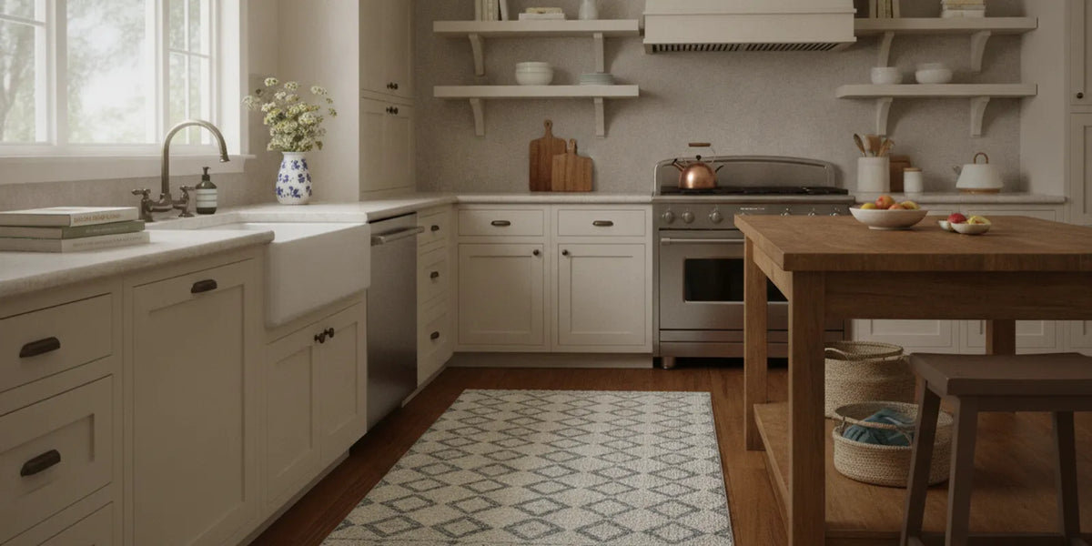
For example, a kitchen with pale cabinets, warm wood and a cream counter could take a warm neutral rug, or a patterned design with a small rust or olive accent. A cool gray floor and blue accessories might make slate, muted teal or a neutral with a cooler cast feel natural. These are starting points, not rules. Hold the rug image beside the actual finishes and ask whether it looks harmonious in the room, not just attractive by itself.
Separate color from value. Hue is the color family, while value is how light or dark it looks. A rug can be blue and still be pale, medium or deep. If the sofa and floor are both light, a medium-value rug can give the seating area definition without introducing a wholly different hue. If the room already has dark furniture, a lighter rug can provide contrast. Decide whether you want the rug to blend, balance or stand out before narrowing your options.
How does lighting change rug color?
Natural and artificial light can make a color appear different at different times of day. Window direction, nearby walls, shadows and bulb color all affect what you see. A product image on a bright phone screen is therefore a comparison aid, not a promise that the rug will look identical in your home.
- Bright daylight: Pale colors may appear especially light, and a low-contrast design may recede. If you want the rug to read clearly, look for a deeper accent or more distinct pattern.
- Low daylight: A lighter field or warm accent may be easier to see. It will not brighten the room itself, so judge it alongside the furniture and lamps.
- Warm bulbs: Cream, tan, rust and gold can look warmer. Blues and grays may appear less crisp than they do in daylight.
- Mixed lighting: A palette that feels balanced at noon can shift under evening lamps. Check images and room samples, if available, in both settings.
A practical test is to take three screenshots or product images you are considering and view them at the same screen brightness. Compare each with a photo of your room, then look again in person at the time you normally use the space. Do not rely on a single image enlarged until its colors are distorted. Also remember that screens vary; if the exact shade is critical, check the live product information and any available color guidance before ordering.
Which color approach fits your room?
Use a neutral as a flexible foundation
Ivory, beige and gray can sit comfortably with many furnishing choices, but undertones matter. A creamy ivory may feel at home beside warm wood, while a cooler gray may relate more easily to blue-gray flooring. A neutral does not have to be plain. A tonal motif or a few contrasting lines can add interest while leaving room for patterned curtains or cushions.
Light, solid fields may make crumbs or marks easier to notice than a multi-tone design. That does not mean a pale rug is automatically a poor fit: in a lower-traffic bedroom, its calm look may be worth the extra visual attention. In a kitchen or entry, consider whether a pattern and several colors better suit the stretch between cleanings. Neither palette removes the need to respond to a spill.
Choose one accent when you want color
A colorful rug can give a simple room a focal point. Pick a shade that relates to something already present, then repeat it once or twice in smaller details. If a rug has deep blue and a small ochre accent, for instance, a blue cushion and a modest warm-toned object can help the palette feel deliberate. Exact matching is unnecessary; a close family resemblance can be enough.
Look at the largest surfaces before committing to a saturated shade. A bold red may energize a neutral room but compete with colorful cabinets or a patterned sofa. When the rug itself is the strongest color, simplify nearby accents. When the room already has strong color, consider a quieter rug that supports rather than challenges it.
Use a multicolor design to bridge finishes
A multicolor rug can connect wood, paint and upholstery that do not match exactly. Start by finding its dominant ground color, then identify one or two smaller colors that echo the room. If every color in the rug is equally vivid, it may compete with other focal points. A calmer ground can make a lively pattern easier to live with.
Pattern scale changes the effect. Small motifs can read like texture from across the room; large shapes become a stronger visual feature. Think about viewing distance and what will be covered by a table, bed or chairs. A border that makes a strong impression in a product photo may mostly sit under furniture, while an all-over motif can remain visible in fragments.
How can you shop the color collections?
Browsing by color is useful when you have a palette in mind, but treat a collection as a starting point rather than a final recommendation. Open the live listing, compare the actual color options and pattern scale, and confirm that the desired size is currently offered. Collection labels can help narrow the field; they cannot tell you exactly how a design will look beside your floor or in your light.
- Choose a color family. Start with a broad direction such as a light neutral, blue, green, red or gold rather than trying to name an exact shade.
- Compare undertones. Look for warm or cool notes that make sense beside your permanent finishes.
- Check contrast. Decide whether you want the rug to disappear gently into the room or stand apart as an accent.
- Inspect the whole pattern. Consider the ground, border, motif size and accent colors together.
- Confirm the room and size. Review the product listing and measure the space before choosing a variant.
- Return to the room. Compare the finalists against the real furniture and lighting instead of making the choice from collection thumbnails alone.
When two options seem equally attractive, compare them against the room’s most limiting feature. If the floor is strongly colored, select the option that relates to it without copying it. If the room has several patterns, choose the one with less visual competition. If the room is mostly neutral, decide whether you want a quiet texture or a more noticeable focal point. Browse the room and color browsing guide to explore available paths, then verify the current product details.
How should color work in each room?
Kitchen: coordinate with cabinets and counters
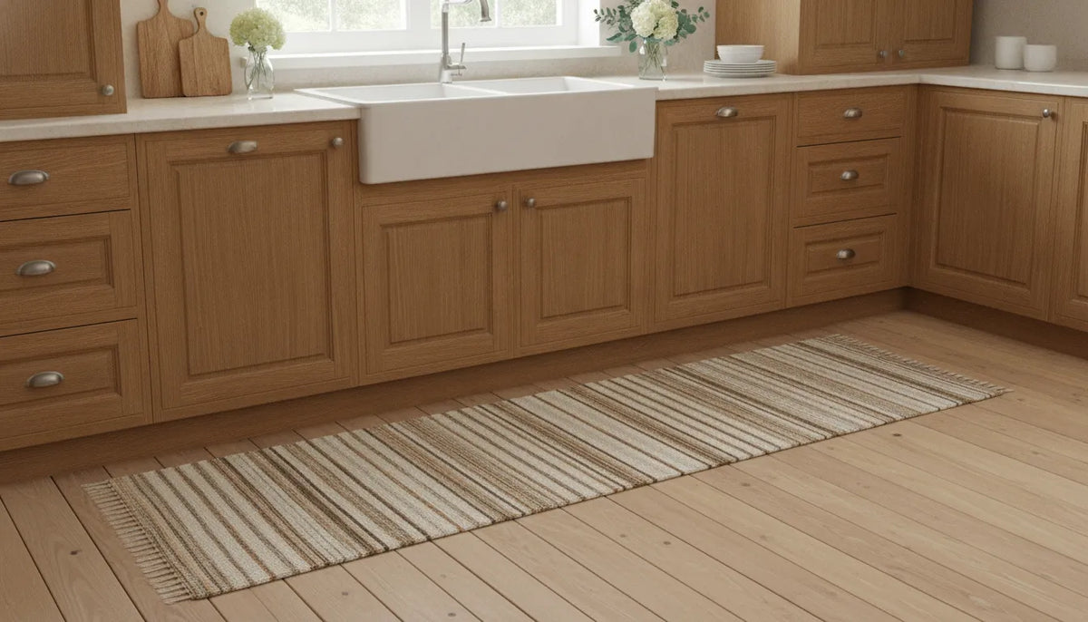
The kitchen is a practical place to choose a rug around daily use. A 2.5x7 runner can sit in front of the sink or stove, where dishwashing and cooking splashes happen, if the layout and clearances allow. Repeat a tone from the cabinets, counter or backsplash so the runner feels related to the room. A pattern with several shades can be visually forgiving between cleanings, but it is not stain-proof and does not replace prompt care.
For a dog that eats or drinks messily, a runner near food and water bowls may help keep the floor clean. Place it where people can still move comfortably and where the doors or appliances are not obstructed. If the kitchen has a busy backsplash, choose a simpler rug palette; if cabinets and counters are restrained, a stronger pattern can bring color into the room. Explore the kitchen rug collection and confirm the current options.
Entryway: relate the first impression to the next room
An entry rug is one of the first colors someone sees. It can echo a hallway wall or a color in the adjoining living area, giving the transition a sense of continuity. If the nearby rooms use different palettes, choose a pattern that includes a small note from each rather than trying to make the whole rug match both spaces.
Think about how much contrast you want at the door. A darker or multi-tone pattern may make routine marks less noticeable than a pale, flat field, but no color guarantees that dirt disappears. Measure the usable floor area and check door swing before deciding. Browse doorway and entrance rugs for designs intended for those spaces.
Living room: start with the largest furniture
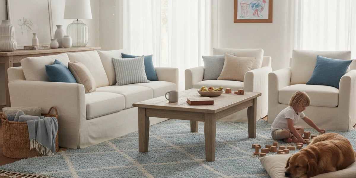
In a living room, the sofa and large chairs are useful color anchors. A rug can repeat a shade in the upholstery or create a deliberate contrast against it. If the sofa is patterned, a quieter rug may reduce visual competition. If the furniture is neutral, a stronger rug can add personality without requiring the whole room to change.
Consider what will remain visible. A central coffee table can hide part of a motif, and chair legs may interrupt a border. If you want the pattern to read clearly, choose a design that still makes sense when only sections are exposed. Look through the full rug assortment while keeping your room colors and placement in view.
Bedroom: keep the palette comfortable to wake up to
Bedrooms often suit colors that feel restful to the person using them. Soft neutrals, muted blues and subdued greens can sit calmly beside bedding. If you change duvet covers often, choose a rug that works with more than one bedding palette rather than matching a single set exactly.
A more expressive bedroom can let the rug carry a distinctive pattern while the bedding remains simple. Check whether the dominant shade relates to the wall color and how much design will show beyond the bed. The bedroom rug collection is a useful place to compare room-appropriate designs, subject to live availability.
Pet feeding and litter areas: make the use case part of the palette
Color can matter in small, hardworking zones as much as in a full room. A rug under pet bowls may coordinate with nearby cabinets while giving the feeding spot a defined footprint. For cat owners, a 3x5 accent rug is often used under a litter box to help keep the area cleaner and help keep litter from spreading through the house. That is a practical placement idea, not a promise that all litter or mess will be contained.
In these spots, consider whether a busy multi-tone pattern suits the surrounding floor and whether you will be comfortable noticing and cleaning debris. Keep the rug placement sensible for the room and follow the product’s care directions. A color that blends with the floor may look subtle, while a contrasting field makes the pet area easier to see as its own zone.
What do color and pattern do together?
Two rugs in similar shades can feel very different if their pattern contrast or scale changes. A low-contrast motif in related colors tends to blend into a layered room. A high-contrast design draws the eye and can become the focal point. Pattern density also matters: many small marks can read as texture from a distance, while a few large shapes stay visually distinct.
- For a layered room: Repeat an existing color or choose a restrained pattern, so the rug does not compete with curtains, cushions and art.
- For a simple room: A bold hue or larger motif can add character; keep other accents selective.
- For a compact space: Consider how much pattern is visible and whether high contrast makes the floor feel busy.
- For an open-plan home: Use related colors across zones for continuity, or make a clear accent the boundary between uses.
Imagine an open kitchen and dining area with neutral cabinets, wood flooring and a blue dining chair. A muted blue runner can connect the work area to the chair without turning the whole floor blue. In a separate living area with a patterned sofa, a tonal rug could calm the visual mix. The objective is not a perfect color formula; it is to decide where the eye should go and repeat enough of the palette to make the choice feel intentional.
How do you compare two finalist rugs?
When you have narrowed the options, make the comparison concrete. Write down what each design does well and what may be difficult in your room. This avoids choosing solely because one thumbnail looks more appealing at first glance.
| Question | Option A: quieter palette | Option B: stronger contrast |
|---|---|---|
| What does it do visually? | Blends with nearby finishes and leaves other decor prominent. | Creates a focal point or defines a zone. |
| What should you check? | Whether it disappears too much in low light or beside similar flooring. | Whether it competes with existing patterns and colorful furniture. |
| Where might it suit? | A layered room, bedroom or patterned seating area. | A simple kitchen, entry or neutral living room that needs an accent. |
| What is the next step? | Compare undertones against permanent finishes and check the pattern close up. | View it in daylight and evening light, then confirm size and availability. |
This is a visual comparison, not a rule that one style is more practical. A calm rug can show marks, and a lively pattern still needs cleaning. Likewise, a dark rug may disguise some dust from a distance without making it vanish. Choose the look you are willing to see every day and the care routine you are prepared to follow.
How should care influence a color choice?
Color does not determine whether a rug is washable, and a busy-looking pattern is not stain-proof. My Magic Carpet describes its rugs as one-piece washable designs with a built-in waterproof lining within the nonslip backing. That lining can make a liquid spill or pet accident less likely to soak through to hard-surface flooring; it is not a guarantee of floor protection in every situation. Nonslip backing is for suitable floors, and traction is not effective over carpet.
For a spill, blot promptly and spot-treat. Some stains, especially oil-based ones, can set quickly. For a larger accident or a wash, follow the care directions: wash separately on a cold delicate cycle with mild detergent, then tumble-dry on low or air-dry. Do not use bleach, high heat or an iron. Check the product’s size-specific washing guidance before choosing a larger rug for your home washer.
A pale solid may make a mark easier to notice, while a mixed pattern may make small variations less prominent from across the room. Neither observation is a cleaning promise. Select the rug based on palette, placement and a care routine that works for you. For more about construction, read how the rug is designed, and consult the product and care FAQs for current guidance.
What should you check before ordering?
- Map the room. Note floor, wall, cabinet, upholstery and large textile colors.
- Choose the role. Decide whether the rug should blend, connect finishes, define an area or become a focal point.
- Set a color direction. Choose a broad family and decide whether its undertone should feel warm, cool or neutral.
- Assess pattern load. Compare the rug with other patterns and consider how furniture will cover it.
- Check real placement. Measure the usable area, door clearance, appliance access and walking paths.
- Compare lighting. Look at the finalist in daylight and evening conditions, using the product image as a guide rather than an exact color guarantee.
- Plan for use and care. Consider likely spills, pet activity and the cleaning instructions; do not assume color alone will solve mess.
- Confirm live details. Review the current product page for size, color options, care instructions and availability before purchase.
Frequently asked questions
Which rug color is easiest to coordinate?
Neutrals such as beige, ivory and gray can work with many palettes, but undertones still matter. Compare the rug with the floor and large furniture, then decide whether you want a close blend or a clear contrast.
Do patterned rugs hide every stain?
No. A pattern may make some marks less noticeable from a distance, but it does not prevent staining or remove the need for prompt care. Blot spills quickly, spot-treat and follow the washing directions.
Should the rug match the sofa or curtains?
It does not need to match exactly. Repeating one shade from a sofa, curtain or other accent can connect the room. A complementary contrast can work, too, when the overall palette feels balanced to you.
Can I choose a rug color from an online image?
Online images help compare patterns and broad palettes, but screen settings, photography and room lighting affect how color appears. Compare the product with your finishes in more than one light and check the live listing before deciding.
Does a darker rug need less care?
Not necessarily. A darker or busier design may make some marks less obvious at a glance, but it can still need prompt spot treatment and washing according to its care instructions. Color is not a substitute for cleaning.
Get help narrowing down your rug choices
The best washable rug color is one that feels connected to your room, suits the way you use the space and remains a choice you enjoy in both daylight and everyday life.